Responsive Layout in LiveCode Create
This guide provides a comprehensive overview of Responsive Layout, including its key features, easy-to-use tools, and how it works behind the scenes.
What is Responsive Layout?
Responsive Layout ensures your app adapts seamlessly to various screen sizes and orientations. Whether you’re designing for mobile, tablet, or desktop, you can:
- Arrange widgets vertically or horizontally with layout containers.
- Control spacing, alignment, and size using simple property settings in the Property Inspector.
- Preview layouts at different sizes by toggling breakpoints in the Canvas Area.
You can achieve all of this visually — without having to write a line of code — while still having the flexibility to customize behavior with advanced settings if needed.
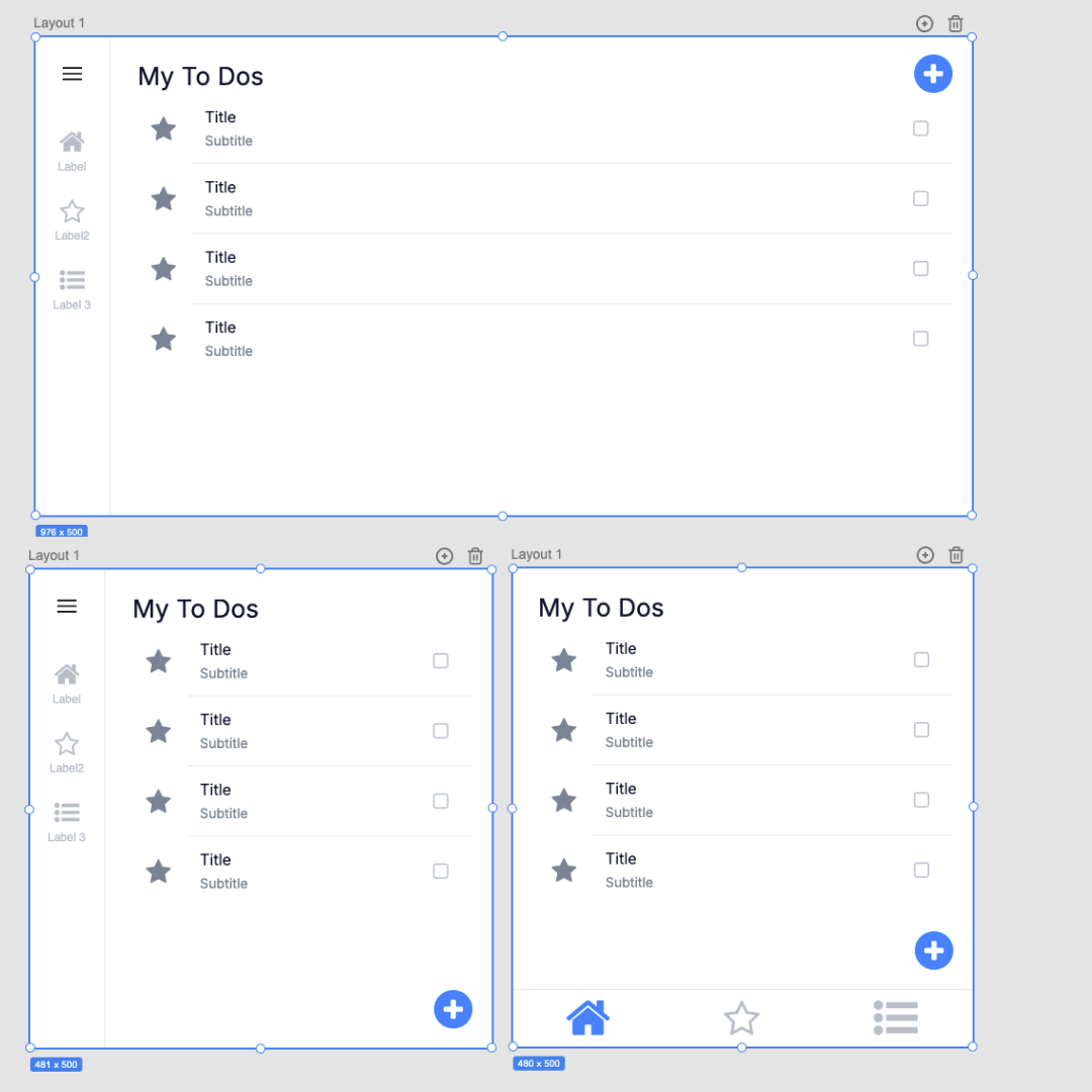
Key Features of Responsive Layout
1. Responsive Layout Containers
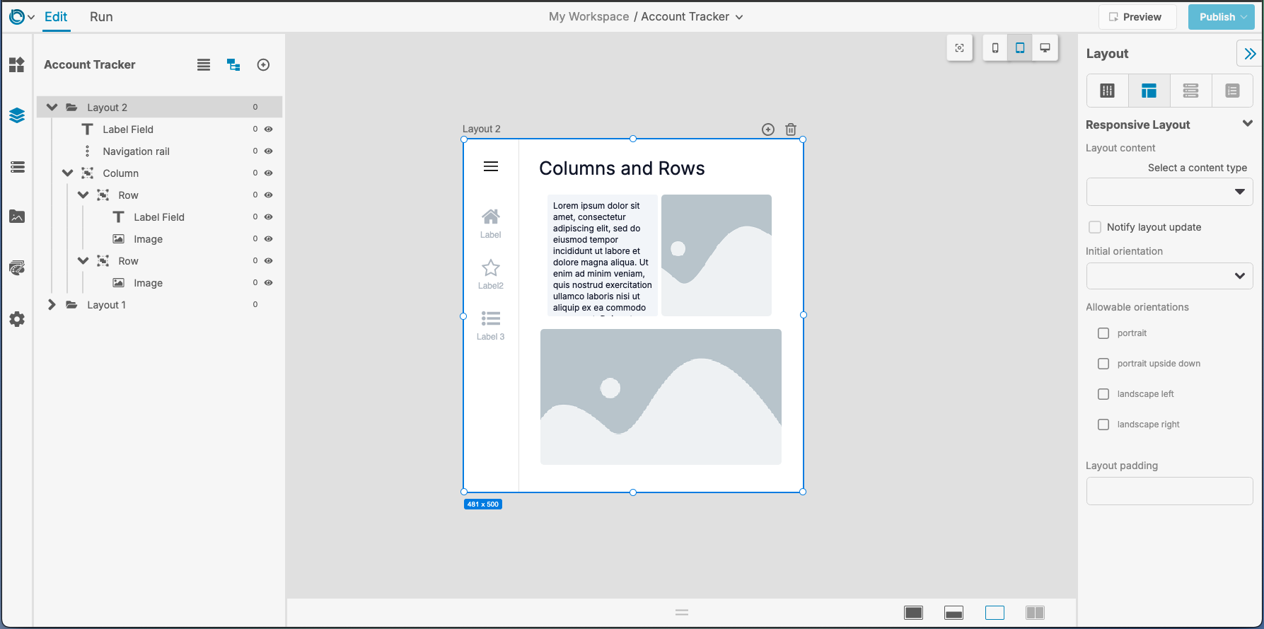
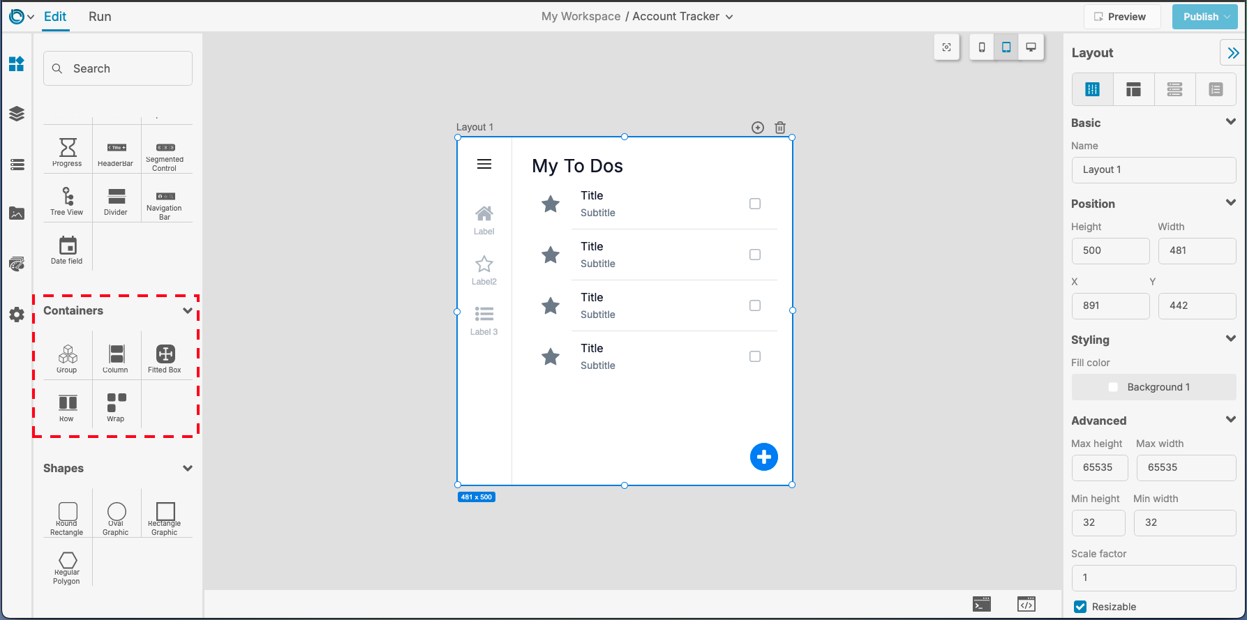
The easiest way to create a responsive design is by dragging layout containers from the Tools Palette onto the Canvas Area. Adding widgets into these containers will arrange and align them based on the container type:
- Row: Arranges widgets horizontally in a row.
- Column: Arranges widgets vertically in a column.
- Wrap: Automatically wraps widgets into new rows or columns when space runs out.
How to Use:
- Drag a layout container (Row, Column, Wrap) from the Tools Palette onto the Canvas Area.
- Drag widgets like buttons, fields, or images into the container.
- Use the Responsive Layout Tab in the Property Inspector to adjust alignment, margins, spacing, and size.
2. Breakpoints: Adapting to Different Screen Sizes
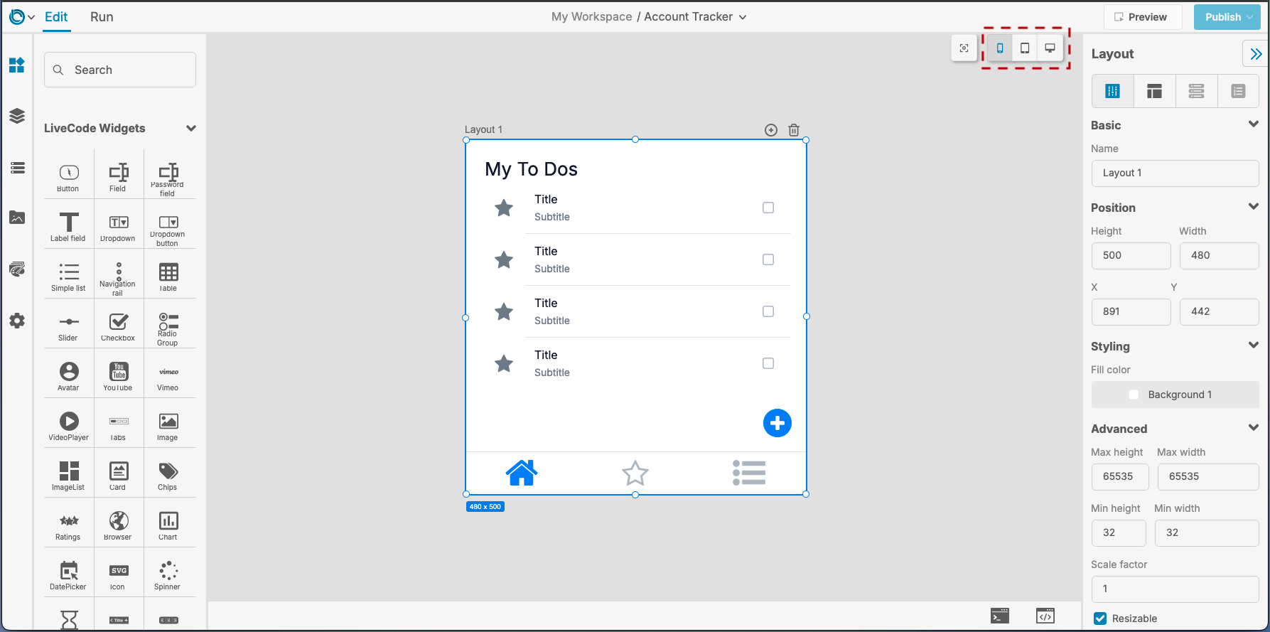
Breakpoints allow you to define how your layout behaves at specific screen widths (e.g., mobile, tablet, desktop).
How to Use Breakpoints:
- Use the Breakpoint Buttons in the Canvas Area to toggle between screen sizes.
- At each breakpoint, rearrange widgets, set margins, and align items using the Responsive Layout Tab in the Property Inspector.
- You can easily test how your layout adjusts by toggling through each breakpoint.
3. Responsive Properties
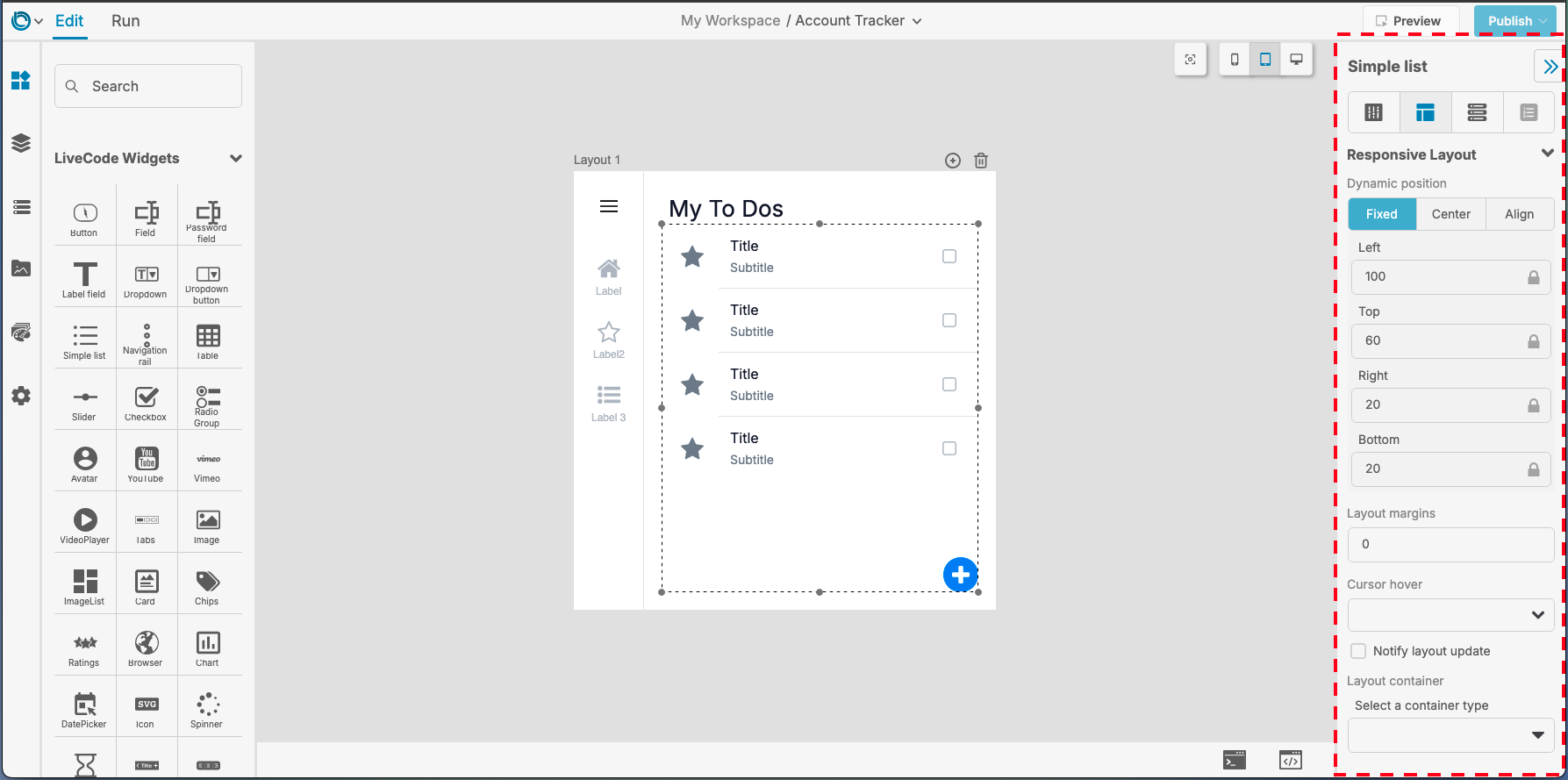
Responsive behavior is adjusted through simple settings in the Property Inspector. For advanced users, properties can also be controlled using script, but this is completely optional.
Key Properties in the Property Inspector
| Property | Description |
|---|---|
| layoutPosition | Positions a widget within its container (center, align, fixed). |
| layoutMargins | Adds space outside a widget (e.g., top, left, right, bottom). |
| layoutPadding | Adds space inside a container between its edges and child widgets. |
| layoutContent | Aligns child widgets within a container in a column, row, wrap, or fittedBox. |
| Flex Factor | Allows widgets to share available space dynamically, when ordered within a row or column. |
| layoutContainer | Controls how a widget behaves in its parent container (expanded, flexible, fullWidth, fullHeight, fullSize, fluid, widened). |
Tip: To set any of these properties, simply use the dropdown menus, sliders, or input fields in the Property Inspector.
Creating a Responsive Layout
Here’s a step-by-step guide to building a responsive layout:
1. Add a Layout Container
- Drag a Row, Column, or Wrap layout widget from the Tools Palette onto the Canvas Area.
- Open the Property Inspector and select the Responsive Layout Tab.
- Adjust properties like alignment, spacing, and margins visually so that your container is positioned as you want.
2. Add Widgets to the Container
- Drag widgets (e.g., buttons, text fields, images) into your layout container.
- Use the Responsive Layout Tab in the Property Inspector to adjust:
- Margins
- Padding
- Alignment (via
layoutContent) - Sizing (e.g., set the widget to expand or flex to fill space).
3. Adjust Layout for Breakpoints
- Use the Breakpoint Buttons in the Canvas Area to toggle between screen sizes.
- For each breakpoint, adjust widget placement, size, and alignment visually using the Property Inspector.
Example:
- On a mobile breakpoint, center-align a button.
- On a tablet breakpoint, allow the button to expand to full width.

Advanced Option (Optional): You can set breakpoints programmatically for precise control if needed. This will let you exactly define the widths at which you want your layout to switch from one breakpoint to another.
local tOptions
put 576 into tOptions["minWidth"]
addLayoutBreakpoint "MyApp", "mobile", tOptions, "mobile"
Testing Your Responsive Layout
- Toggle Breakpoints: Use the Canvas Controls to preview your layout on different screen sizes.
- Run Mode: Switch to Run Mode to interact with your app and ensure the layout behaves as expected.
- Test Responsiveness: Check edge cases, such as very small screens or large displays.
Best Practices for Responsive Layout
- Start with Containers: Use Rows, Columns, and Wraps as the foundation of your design.
- Preview Early and Often: Use the Breakpoint Buttons to test at every step.
- Combine Alignment and Margins: Use the layoutContent property for positioning and the layoutMargins property for spacing.
- Make Use of Flexibility: Use the Flex Factor and the layoutContainer properties to let widgets share space dynamically.
For further learning: